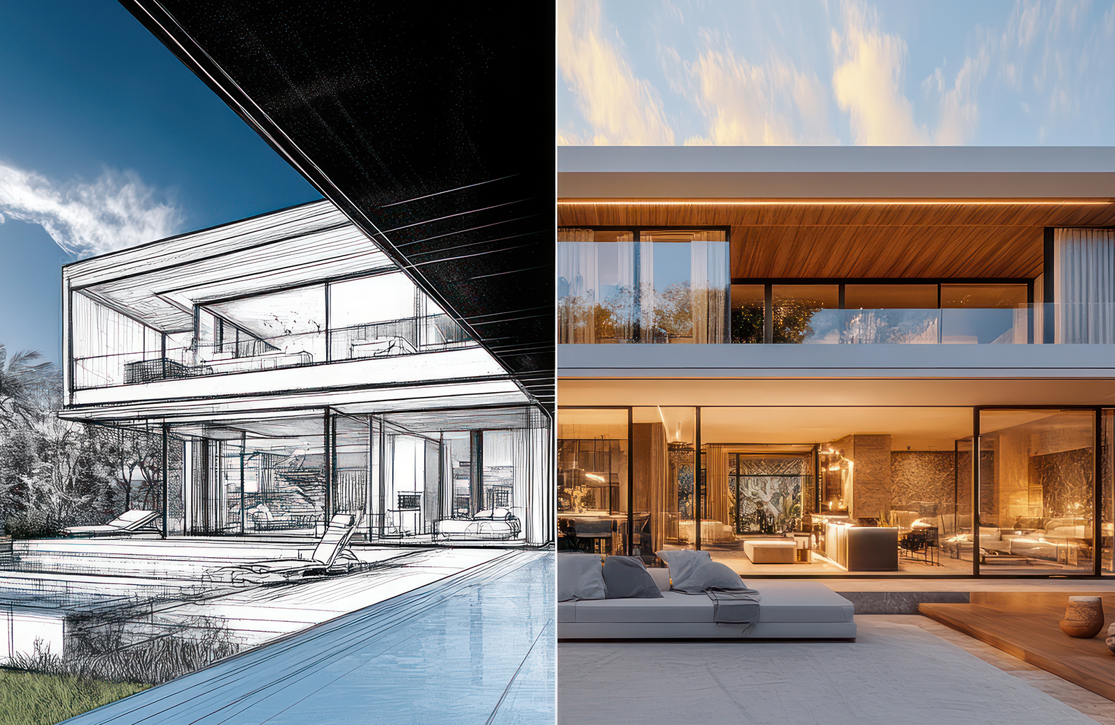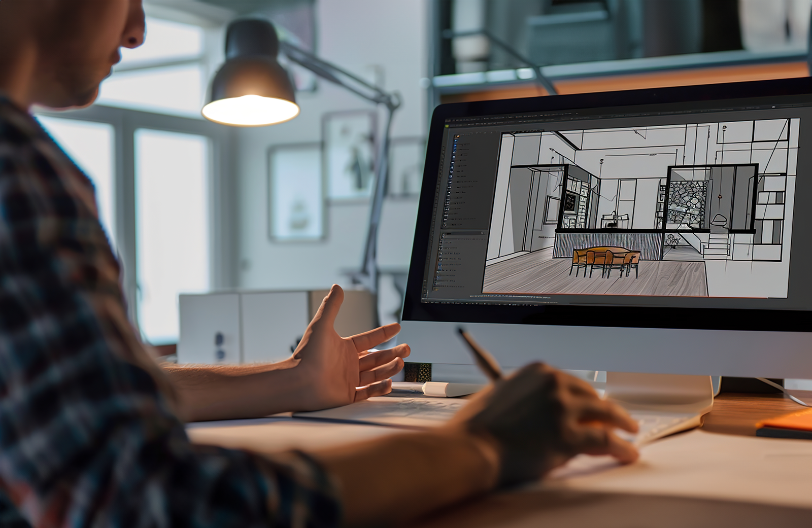

You can have a perfect 3D model and still end up with a render nobody likes.
The geometry’s fine. But the brief was thin, the camera’s parked somewhere odd and the timber cladding looks like it came out of a printer. The client stares at it for a while and says “hmm”. That’s never good.
Most architectural rendering mistakes happen before anyone hits render. Somebody didn’t send the latest drawings, or nobody decided what the image was actually for. You end up with visuals that look fake or say the wrong thing about the design, and then the revisions start piling up.
Here are the ten architectural visualisation mistakes we see most often, roughly in the order they cause grief.
Mistake #1: Starting with an incomplete or unclear brief
Plenty of architectural rendering errors start right here.
The drawings are two revisions out of date. The finishes schedule just says “something light and warm”. Nobody’s mentioned which views are needed, or whether the images are for a client meeting or a billboard. So the studio fills the gaps with guesses, and each guess turns into a round of changes.
Send current drawings and the actual material specs. Throw in a few reference images and a list of the views you want. Tell them where the images will end up. It takes an hour and saves weeks.
Mistake #2: Using the wrong camera angle or perspective
Ultra-wide lenses are tempting. Rooms look huge. They also bend the walls, warp the furniture and turn a perfectly decent lounge into a bowling alley.
Placement causes just as many problems. Drop the camera too low and the ceiling eats the frame. Shove it into a corner and you lose the view the whole design was built around. And then there’s composition: a front door half cropped off, a wheelie bin front and centre.
Stand the camera roughly where a person would stand. Straight verticals, sensible focal length. If it wouldn’t look like that in real life, it shouldn’t look like that in the render.
Mistake #3: Unrealistic materials and textures
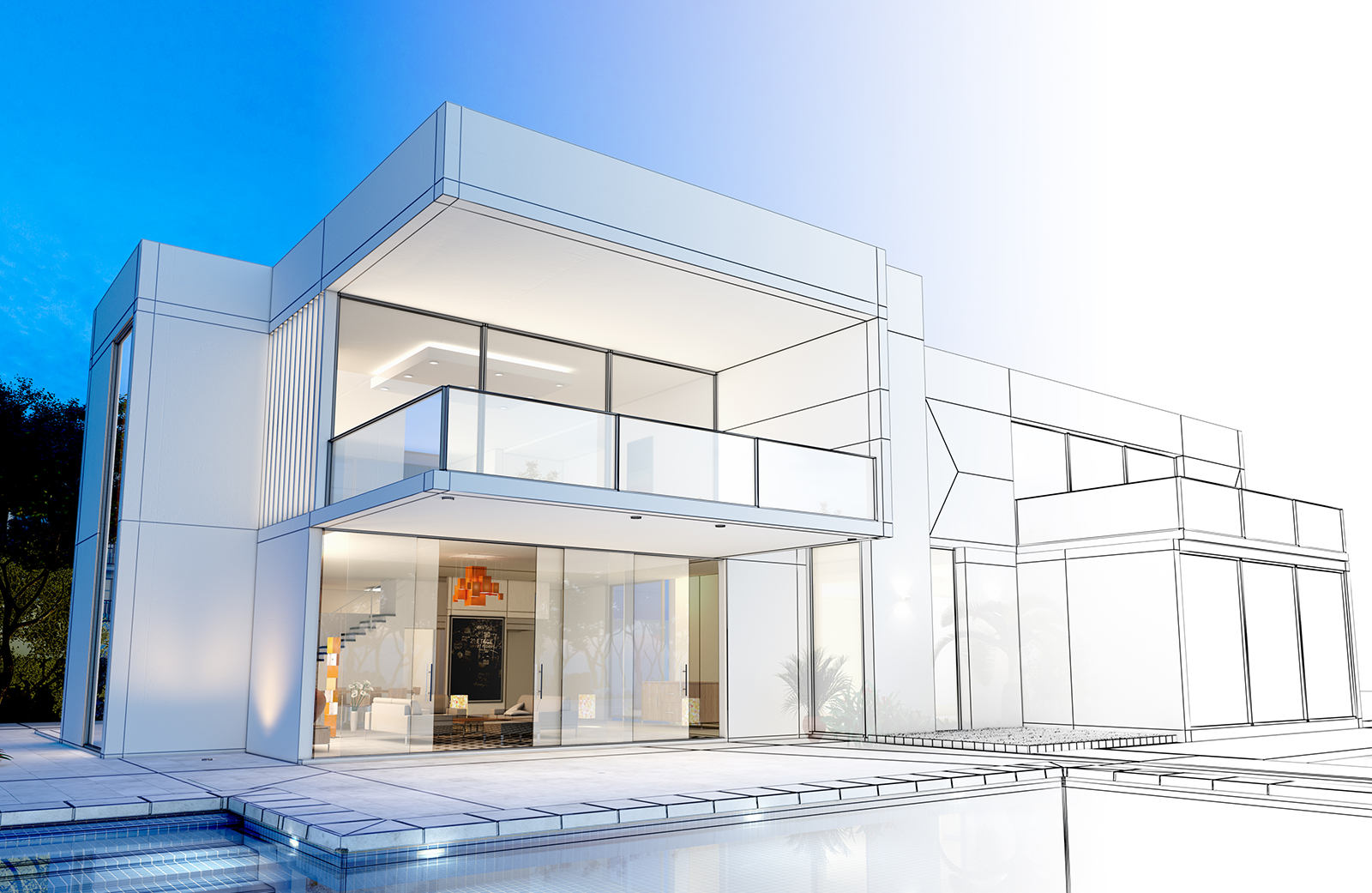
Materials are probably the most common 3D rendering errors of the lot, and they’re the fastest way to make an image look computer-made.
You know the ones. Timber boards twice as wide as anything you can buy. Marble with the same vein repeating every metre like wallpaper. Concrete that’s smoother than a phone screen. Windows that reflect like a bathroom mirror.
Work from real samples. Check the board widths and tile sizes against the actual product, then rough things up a bit. Real timber has knots. Real concrete has blotches.
Mistake #4: Poor or unrealistic lighting
Lighting can wreck a good model in seconds.
Windows blown out to pure white, flat grey light with no shadows, or a sun coming from the south in a Sydney backyard. A gorgeous sunset outside while the kitchen’s lit like an operating theatre. People might not be able to name the problem, but they feel it.
Pick a time of day and commit to it. Match the sun to where the building actually faces. Base the interior lighting on the fittings that are really on the lighting plan, not whatever looks dramatic.
Mistake #5: Incorrect scale and proportions
This one’s sneaky. A sofa 10% too small, a door a little too tall, a window that’s just slightly off. Nobody can point to it, but the whole image feels wrong.
People are the usual giveaway. A figure who’d be 2.3 metres tall in real life ruins everything around them. Architectural rendering errors like this make even a well-lit, well-textured image hard to trust.
Build from proper drawings and BIM or CAD data. Check furniture against the real product dimensions, and use people for scale, as long as they’re people-sized.
Mistake #6: Adding too much or too little detail
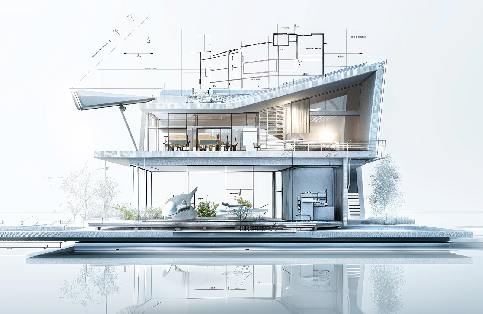
Empty rooms feel like a display home nobody’s ever cooked in. There’s nothing to judge scale by, either.
Then there’s the opposite problem. Fourteen people in the foreground, a throw on every chair, shelves crammed with vases and books. By the time you’ve taken it all in, you’ve forgotten to look at the architecture.
A couple of people and a few well-chosen pieces of furniture usually do the job. If something isn’t helping explain the design, take it out.
Mistake #7: Ignoring the surrounding context
Put a building on a flat green plane and it looks like it’s floating in a video game lobby.
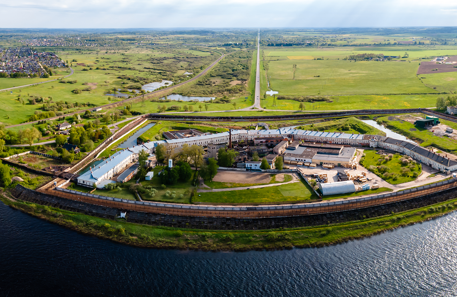
Real sites have neighbours and driveways. They have a slope, power poles and the gum tree that council won’t let anyone remove. Leave all that out and nobody can judge whether the design fits the street. For exterior renders, it’s often the thing assessors look at first.
Model the real terrain, the real street and the houses next door. Site photos and a survey help a lot here.
Mistake #8: Making the render look better than the actual design
Everyone’s seen the render with the impossibly orange sky, a lens flare off the glazing and a garden worth more than the house.
It looks great on the projector. Then the building goes up, the landscaping budget gets cut, and the client remembers the picture. That conversation at handover isn’t fun.
Accurate first, attractive second. If it’s in the frame, it should be something that’s actually going to be built.
Mistake #9: Designing the render without considering its purpose
A render for a planning submission needs different things from one for a real estate listing. Council cares about context, height and sightlines. Buyers care about how it feels to live there. Investors want the whole scheme at a glance.
Make one image try to do all three and it usually doesn’t do any of them well.
Before production starts, ask three things. Who’s looking at this? What do we need them to decide? Where will they see it: a planning report, a sales brochure, a phone screen?
Mistake #9: Designing the render without considering its purpose
A render for a planning submission needs different things from one for a real estate listing. Council cares about context, height and sightlines. Buyers care about how it feels to live there. Investors want the whole scheme at a glance.
Make one image try to do all three and it usually doesn’t do any of them well.
Before production starts, ask three things. Who’s looking at this? What do we need them to decide? Where will they see it: a planning report, a sales brochure, a phone screen?
Mistake #10: Treating revisions as an afterthought
This is where projects quietly blow their deadlines.
Feedback arrives in five separate emails from four different people, two of whom disagree. Someone moves a wall after final rendering has started. Nobody agreed how many rounds of changes were included. These are some of the most common architectural visualisation errors, and none of them are about software.
Collect everyone’s comments and send them in one go. Agree the revision stages up front, lock the design before the final render starts, and leave a few days of slack before the deadline. You’ll need them.
How to avoid architectural rendering mistakes before production
Honestly, most of the above can be headed off with ten minutes and a checklist. Better still, run through it on a quick call with the studio before anything gets modelled.
- Latest drawings sent (not the ones from last month)
- Finishes confirmed
- Camera views agreed
- A few reference images
- Everyone knows what each image is for
- Site photos or survey supplied
- Key dimensions checked
- Resolution agreed
- How revisions will work
- A deadline with a bit of slack in it
Stick it in your project template folder. Future you will be grateful.
Choosing an architectural visualisation partner
Anyone can buy the software. What you’re really paying for is someone who’ll notice when the stair doesn’t line up with the floor above, or tell you the hero angle you asked for won’t flatter the building.
So when you’re flicking through portfolios, don’t stop at the pretty pictures. Look for renders that clearly match the drawings they came from, job after job. Then ask them straight out how they catch 3D architectural rendering mistakes before the images get to you. A good studio will have an answer ready. A not-so-good one will talk about their render farm.
Frequently Asked Questions
What are the most common architectural rendering mistakes?
A vague brief tops the list. After that, it’s warped camera angles, fake-looking materials and bad lighting, with wrong scale close behind.
Why do architectural renders look unrealistic?
Nine times out of ten it’s the materials and the light. Get the texture scale or the sun direction wrong and even a perfect model looks off.
How can architects avoid rendering errors?
Send a proper brief, with current drawings, specs, a few references and a note on what the images are for. Then agree the views and how revisions will work before anyone starts.
What causes poor architectural visualisation?
Usually, the studio didn’t get the information it needed. Other architectural visualisation errors, like cluttered scenes, odd lighting and images with no clear purpose, tend to follow from that.
How can a rendering studio reduce revisions?
Lock the design early and get feedback in one go at each stage. Five emails from four people is how a two-round job turns into six.
Plan your next render
Need architectural visualisation for your next project? Ecompapi Studio helps architects, designers and developers turn accurate design information into architectural renders, animations and visual experiences. Send us your drawings and project details, and we’ll talk through what you need.